Revolut
Project
Solo project
Duration
8 Weeks, 2023
My Role
Research, UI/UX process,
Prototyping, Usability test
Improving the clear user experience of the app
Revolut offers mobile banking services across Europe, but many potential customers have left due to the complicated UI of the remittance process and complaints about customer support. This project aims to address these usability issues by enhancing the user-friendly UI design and improving the intuitive user flow.
CURRENT PROBLEMS
Discover
APP REVEIWS
COMPETITOR ANALYSIS
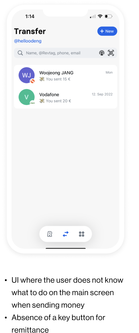
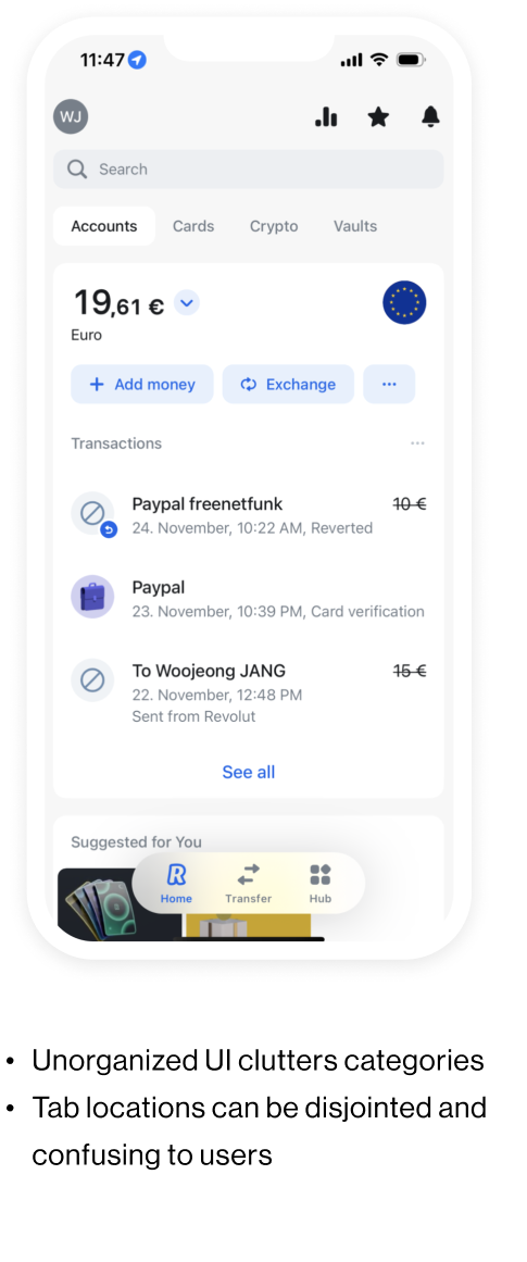
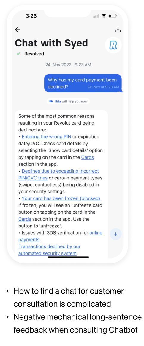
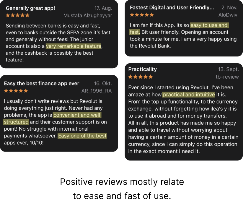
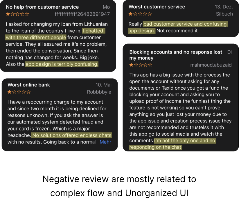
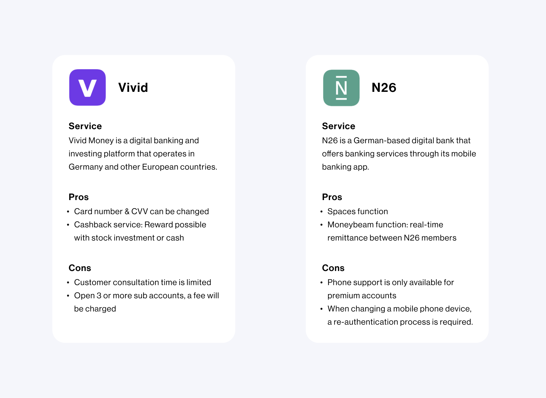
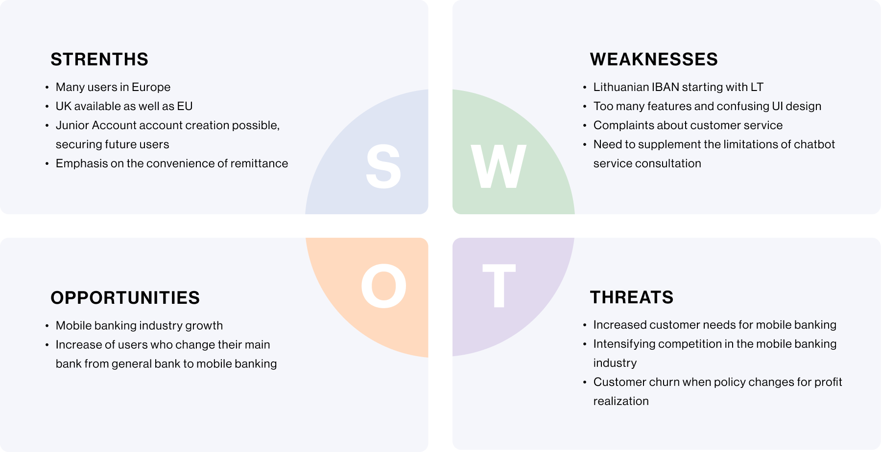
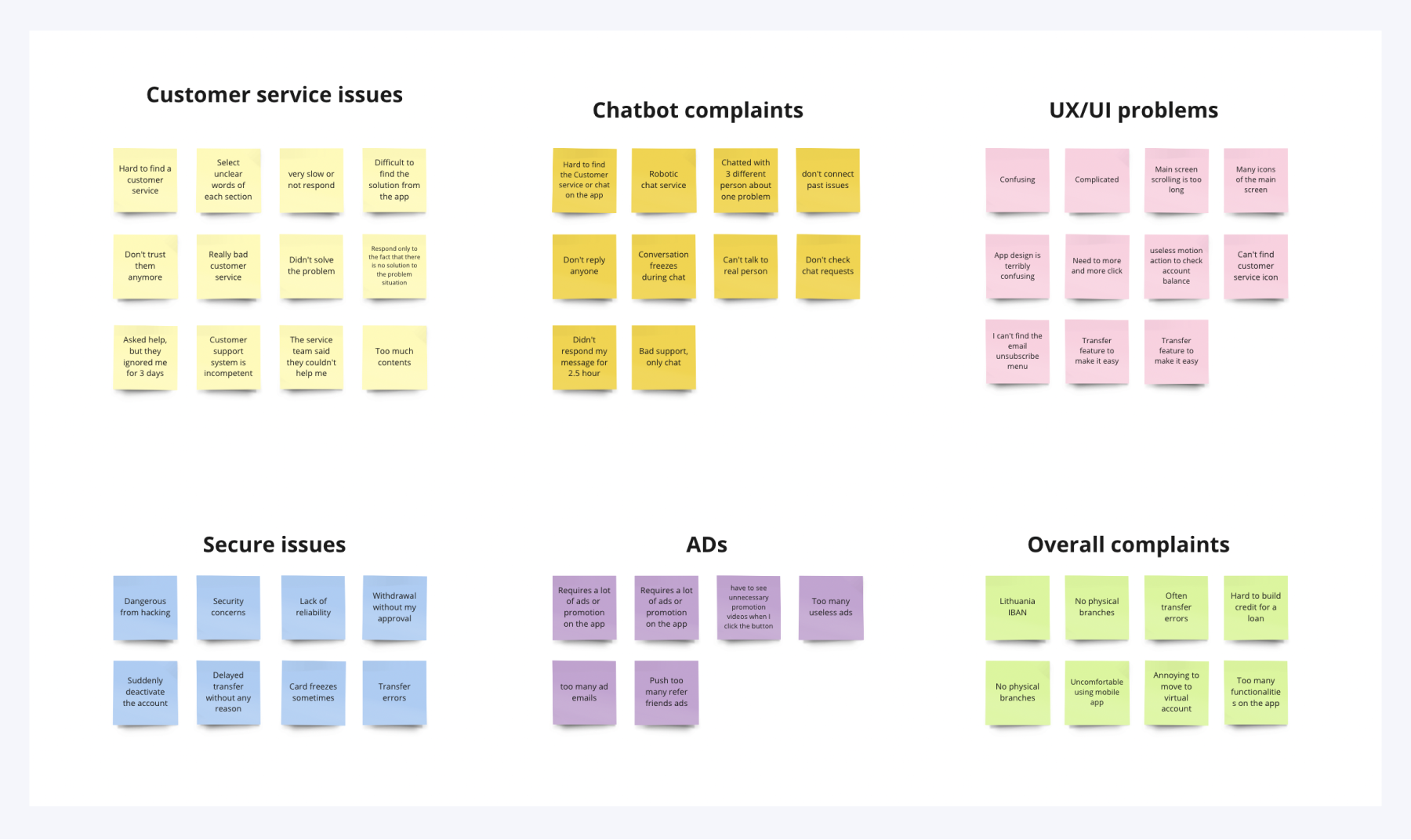
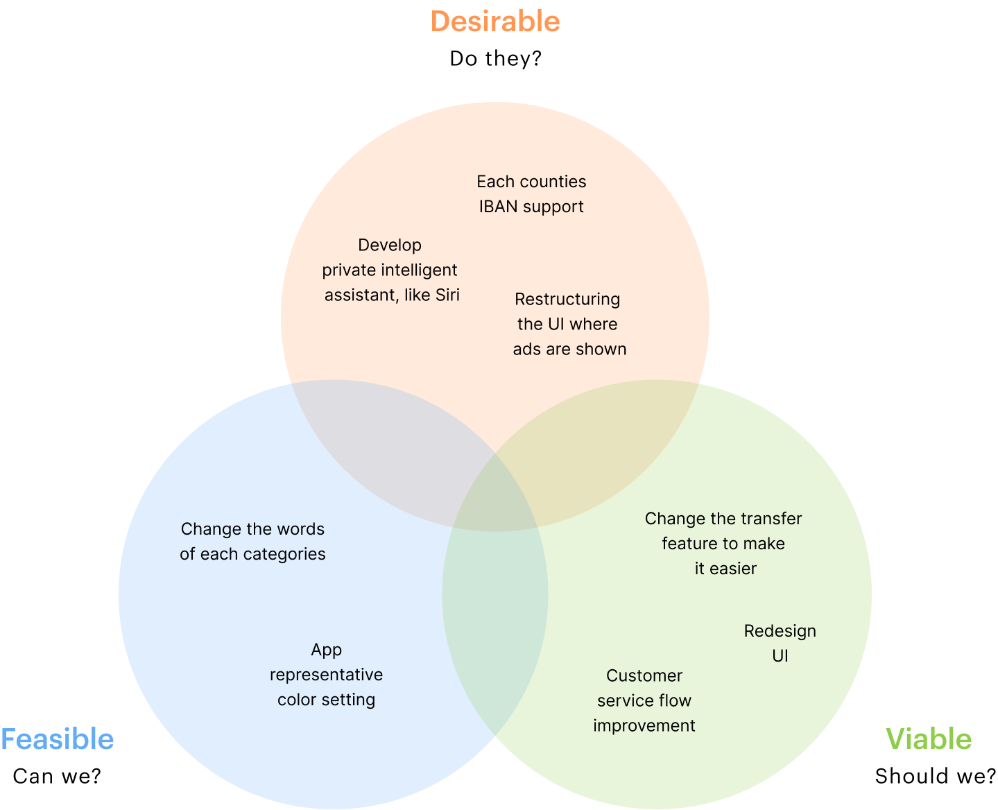
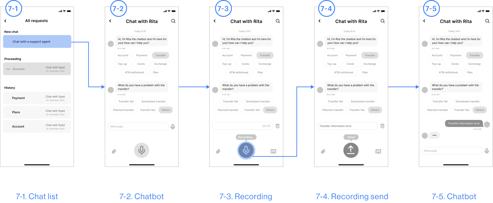
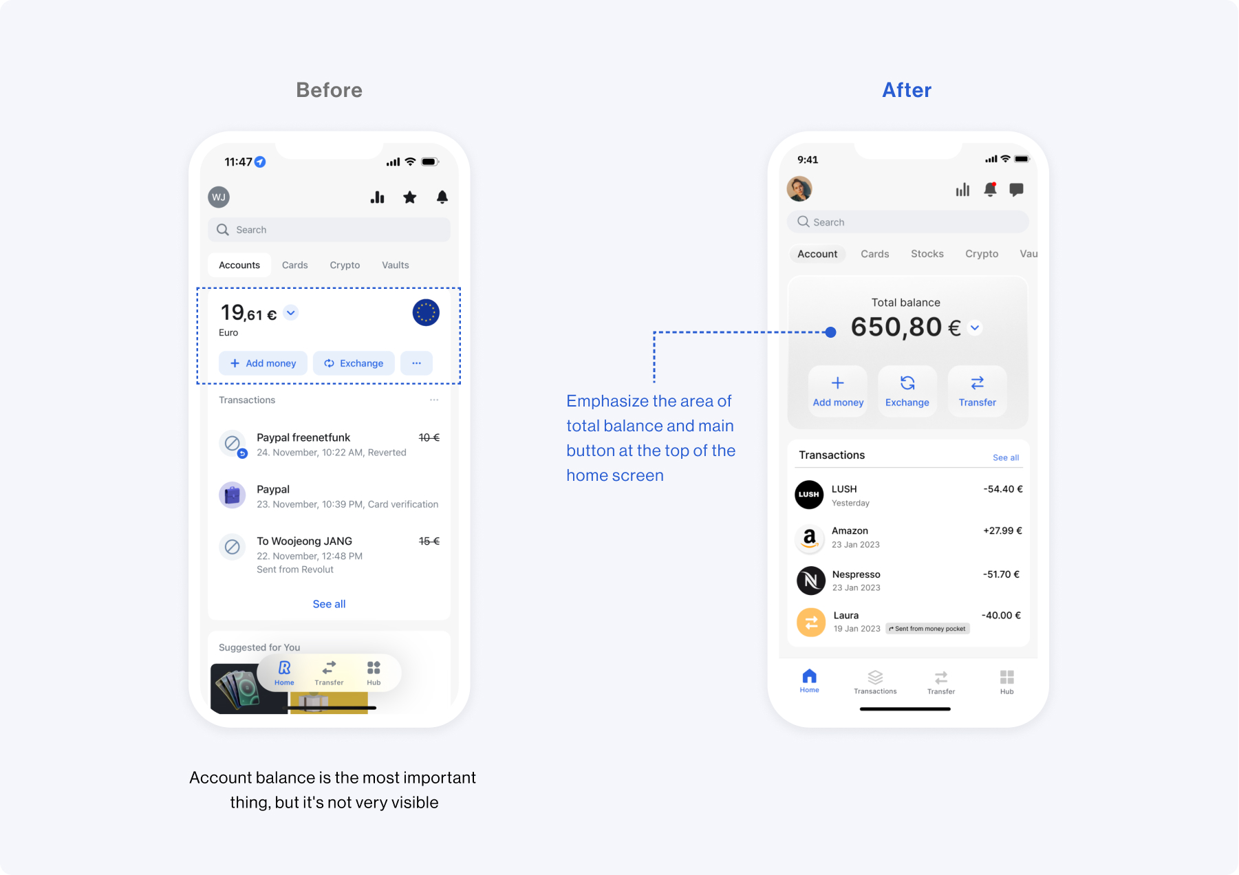
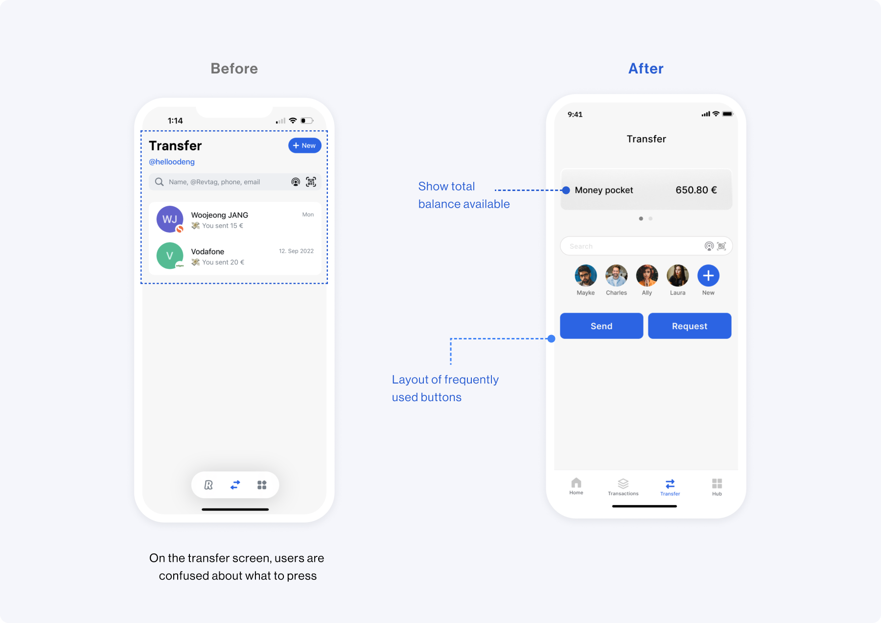
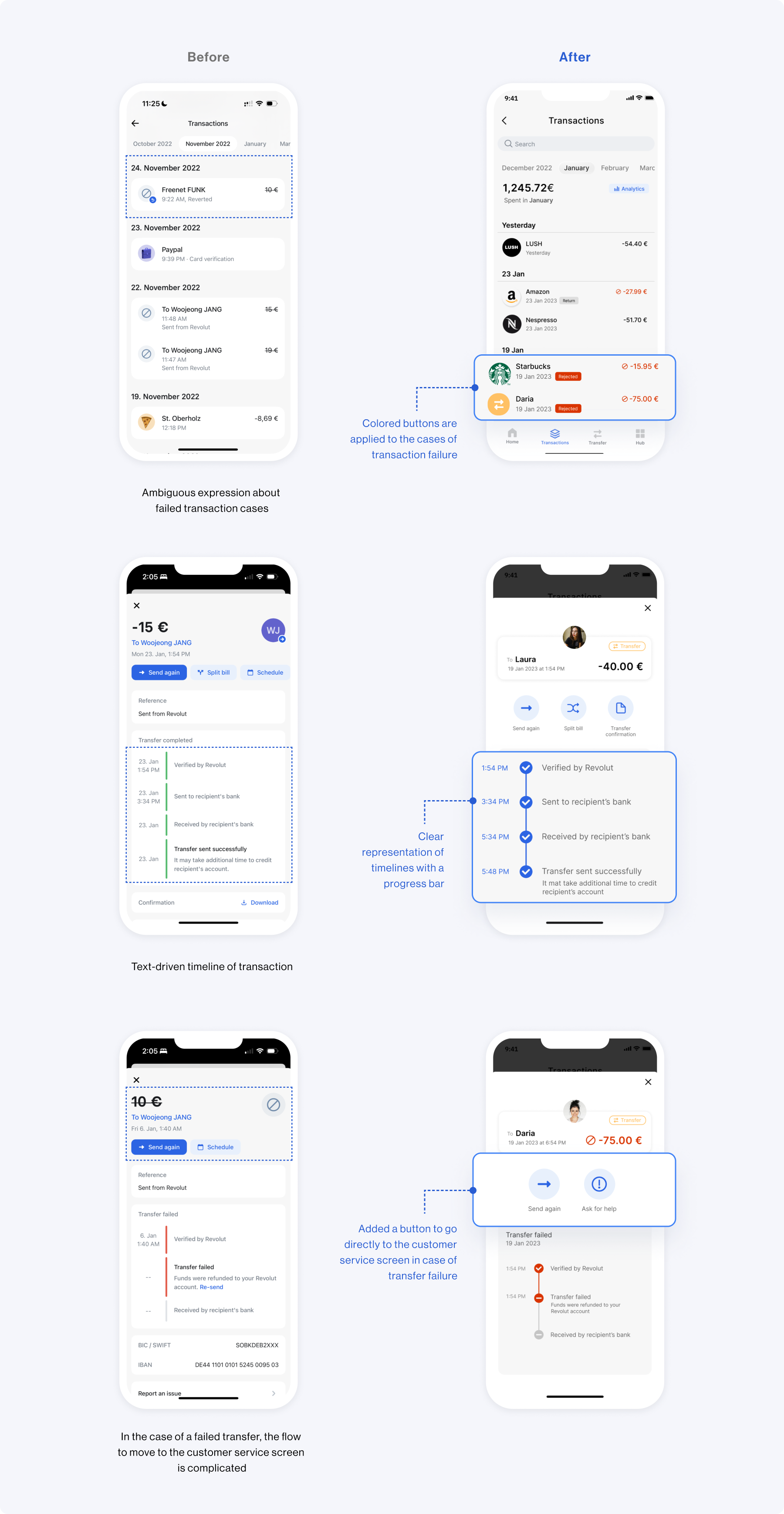
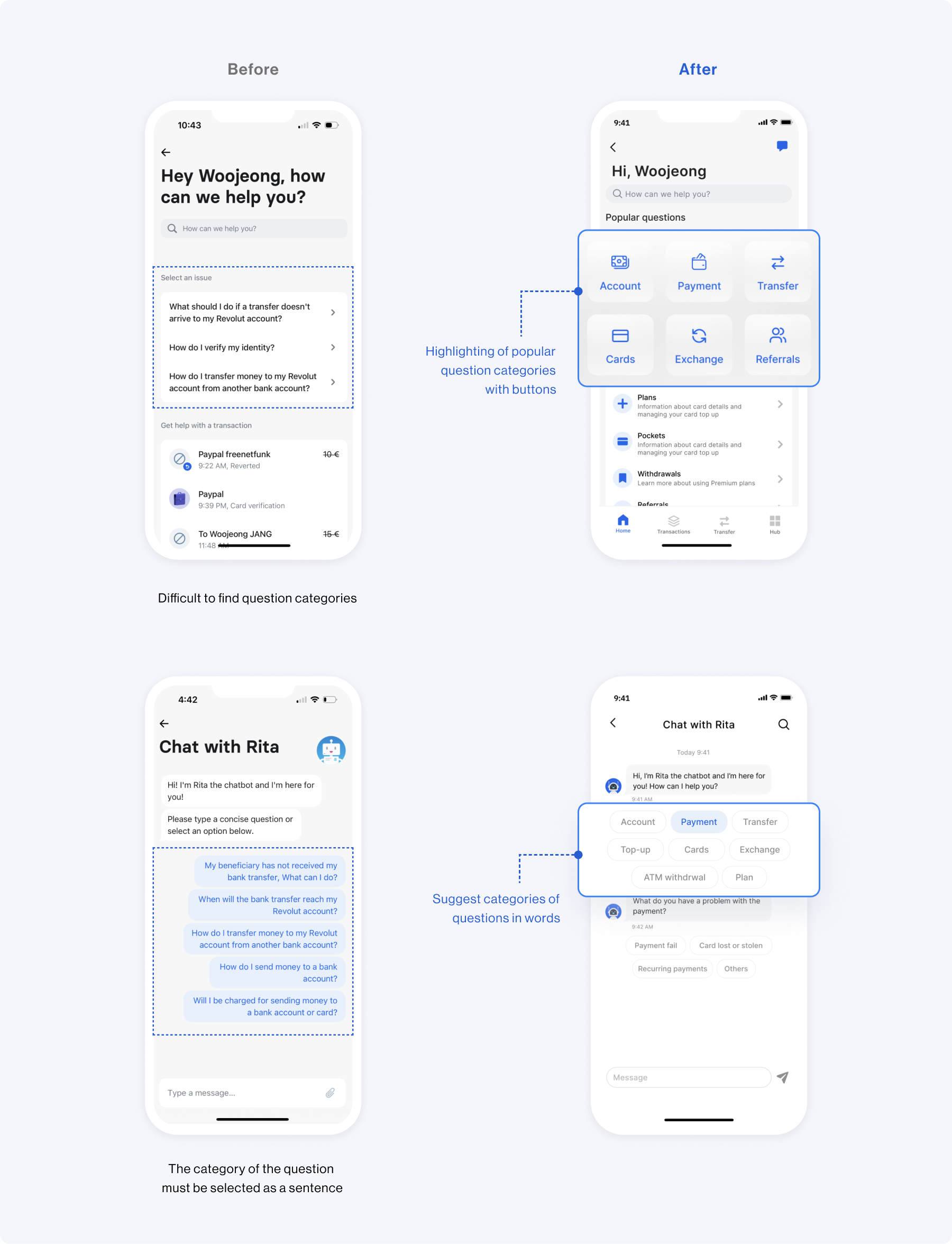
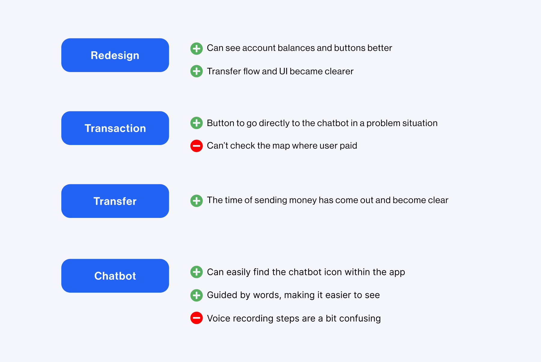
To understand similar products related to mobile banking apps, I have compared them with diverse applications. In addition, according to the reviews from existing users, I did competitive studies and analyzed their strengths, weaknesses, and features.
HYPOTHESIS
How might we make the users have a clear user experience and intuitive flow experience when they use this app?
Define
SWOT ANALYSIS
AFFINITY MAPPING
After research, Affinity mapping was used to synthesize the information.I found a common problem and decided to best deal with what users want.
ASSUMPTION MAP
I drew upon design principles that would set the direction and scope of my design solution. I used a value effort diagram to help me narrow down and prioritize changes to the app.
Key Insight
To synthesize insights from the extensive research, I arranged significant pain points and derived key insights I was going to focus on.
Ideate
SKETCH
With the design principles in mind, I started sketching my ideas based on the define phase.
Deliver
LOW FIDELITY WIREFRAME
Key Features
HOME SCREEN & PROFILE
Improving the user experience by redesigning UI
For an enhanced user experience, the current balance is displayed on the home screen. Additionally, I have enhanced the layout of the profile screen to improve service accessibility.
TRANSFER & TRANSACTIONS
User flow improvement for problematic situations
I improved the user flow through Call-To-Action on the Transfer screen. Additionally, When the event of a transaction fails, the user can move directly to the customer screen.
CHATBOT
Chatting process
improvement
For an enhanced user experience, the current balance is displayed on the home screen. Additionally, I have enhanced the layout of the profile screen to improve service accessibility.
HIGH FIDELITY DESIGN
1. Home screen
I wanted to prioritize improving the better user experience. I've improved the visual hierarchy so that when a user logs into the app, the user's current balance is displayed first on the home screen.
2. Transfer
I improved the user flow and UI by adding a clear Call-To-Action when transferring.
3. Transactions
The user flow has been improved so that failed cases are clearly shown on the transaction screen, and customer consultation can be conducted directly from the screen where there is a problem with payment or transfer.
4. Chatbot Service
Regarding the chatbot process, it has been changed so that problem situations can be selected with concise words instead of sentences.
Testing
USABILITY TEST
After creating the prototypes, I conducted a usability test with 4 participants who use mobile banking apps and live in Europe. Overall, I received feedback that the information presented is more organized and cleaner after the redesign.
Takeaways
What I learned
Banking apps are purpose-built services, so improving the user experience is paramount. After a redesign, conducting a usability test with a variety of users is helpful in evaluating my work and identifying exactly what needs to be improved.
Next time
Revolut's redesign opportunity gave me a deeper understanding of the visual hierarchy, and I'd like to conduct usability tests with various user groups for a clearer design.
More Works
OverviewDISCOVERDEFINEIDEATEDELIVERTESTINGTAKEAWAY